Pavimentazioni, gradini, componenti per scaffalature e piani carrellabili. Scopri con un nostro consulente tutto quello che possiamo realizzare per te.
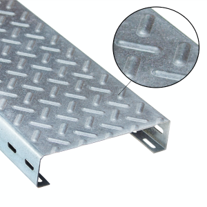
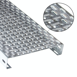
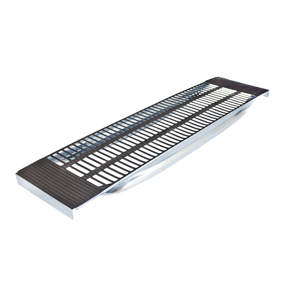
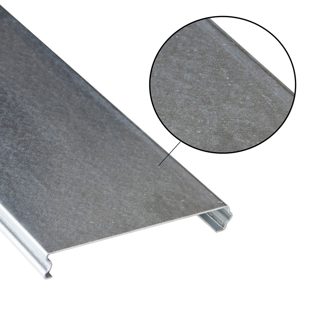
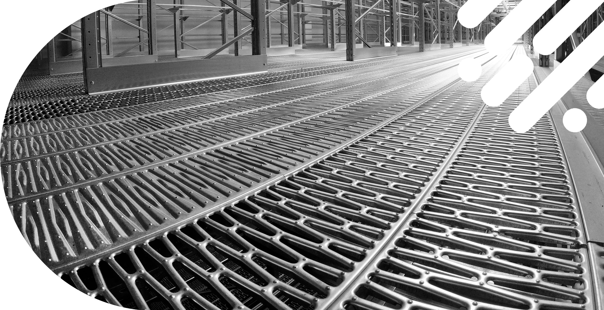
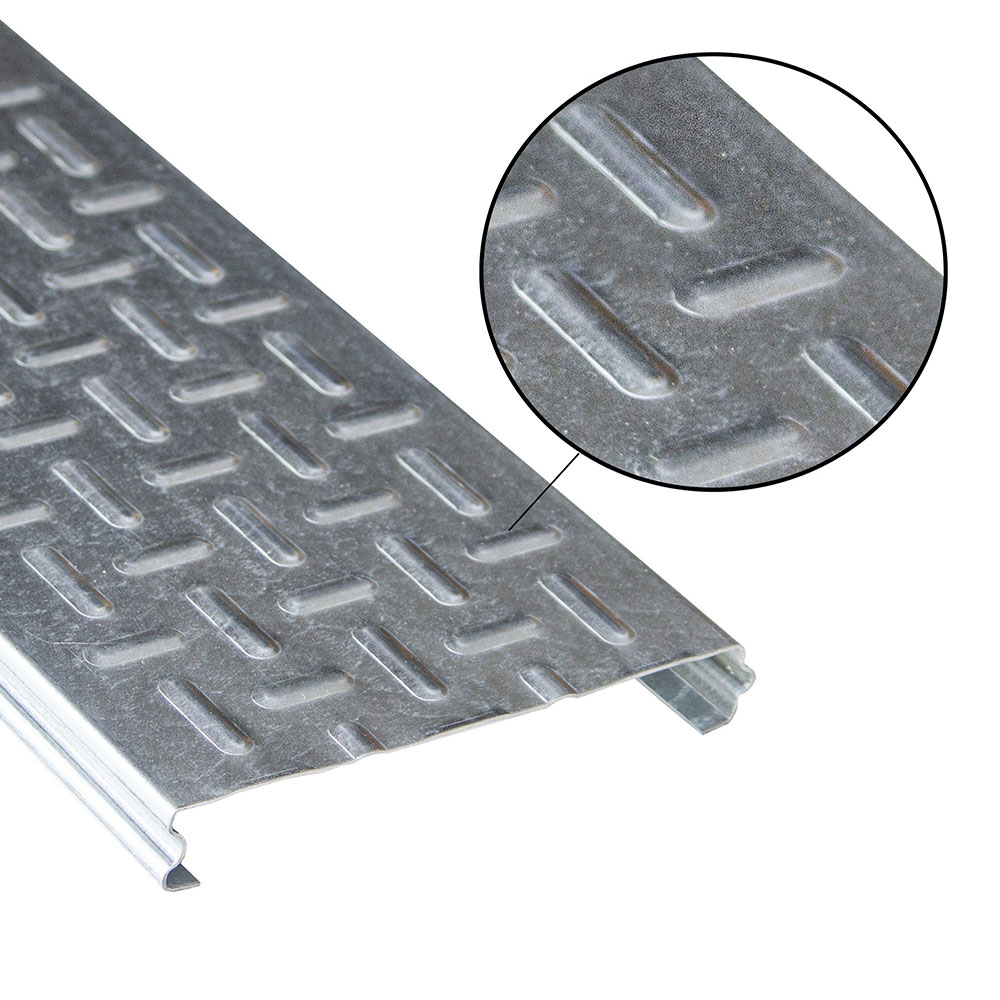
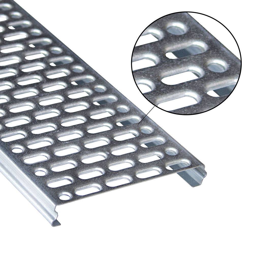
Abagrigliatiproduce pavimenti metallici, grigliati metallici carrabili, gradini grigliati e grigliati metallici per soppalchi. Tutti i prodotti sono progettati per resistere alla corrosione, agli urti e all’usura e realizzati con materiali di alta qualità e resistenza come l’acciaio zincato Sendzimir, l’acciaio grezzo o zincato a caldo.
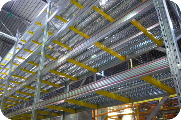
Il grigliato metallico è una struttura versatile e durevole che viene utilizzata in una vasta gamma di settori industriali. Può essere utilizzato come rivestimento per pavimenti, scale, piattaforme e altre superfici, fornendo una finitura sicura e durevole.
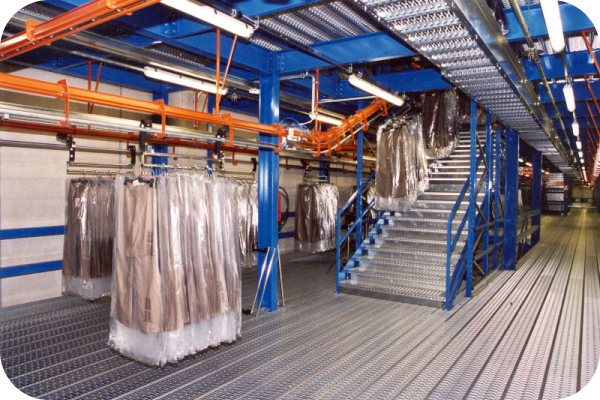
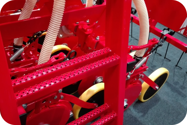
I grigliati metallici sono ideali per la realizzazione di pedane, passerelle e scaffali nel settore dell’industria, nell’ambito civile, nell’agricoltura, nei trasporti e per il magazzino.
Industria e impianti
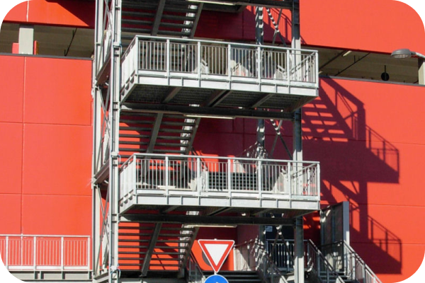
Profili e gradini metallici per piani di calpestio, passerelle, scale interne ed esterne.